For my overall website, I wanted to take everything that I learned this semester in Internet Studio and combine them into a semester project advertising my favorite vacation spot, South Padre Island. I wanted a soft and inviting webpage, inspire by all the websites that already advertise South Padre. I chose to utilize a vertical heirarchy when designning this site. Everthing should direct the user down the webpage. I chose to include a repeating tiled background of a palm tree to create a sense of fun.
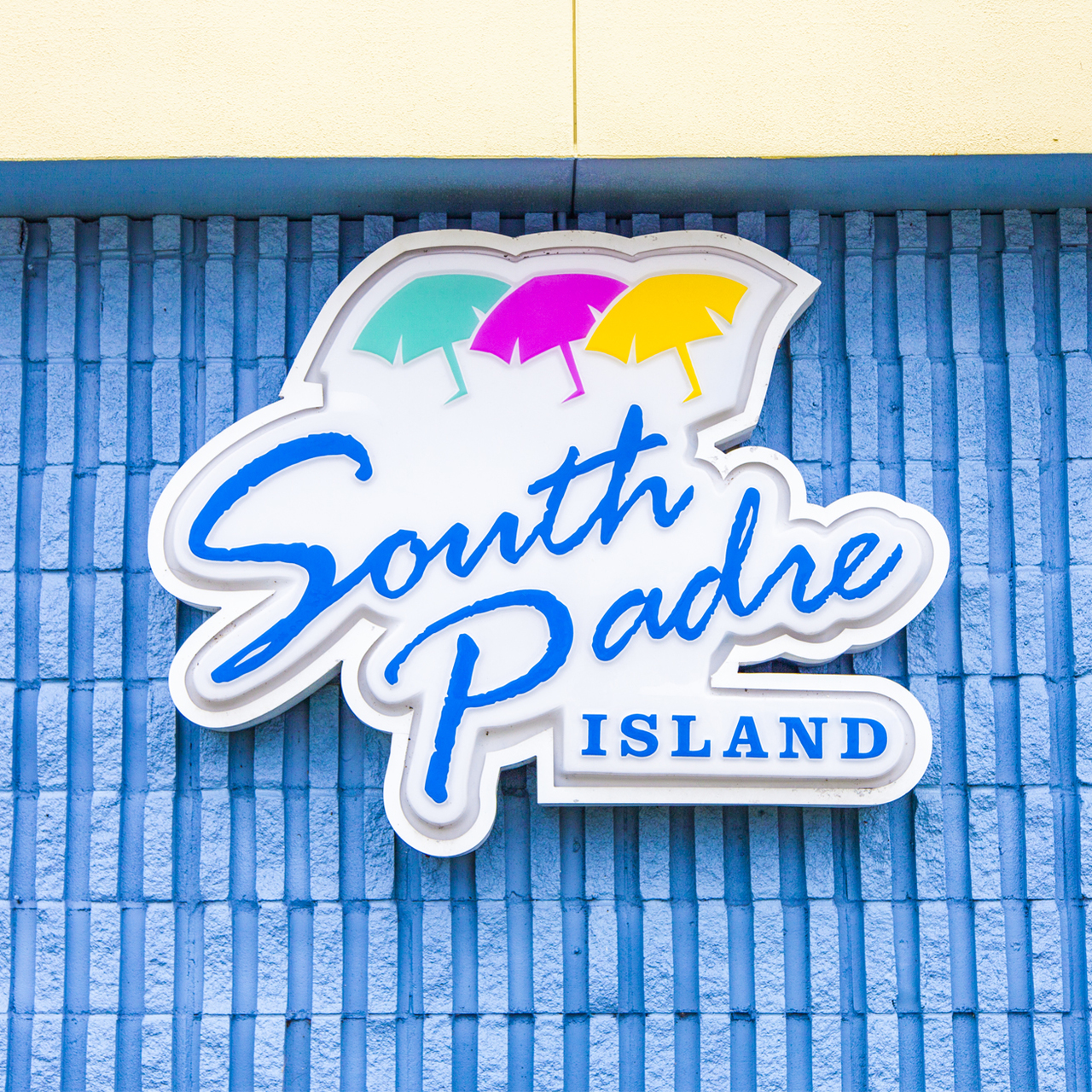
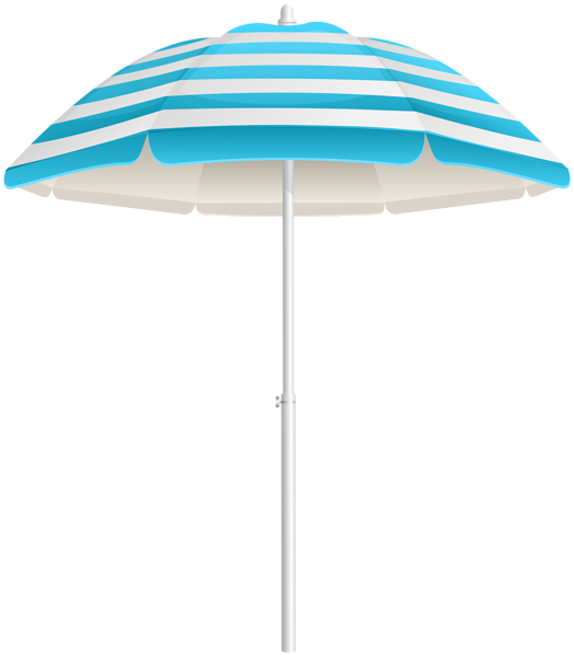
The color palatte of this website is inspired by the colors that remind me of the beach, and specifically South Padre Island. I chose teal and seafoam greens to reflect the costal waters, while utilizing coral to represent sunsets and sealife, and neutral colors to represent sand and warmth. The logo of the site is a bright yellow to represent the sun, and a dark blue to show the sky. These colors together will create a tropical atmosphere that will set the mood for potential visitors.
Colors Used:
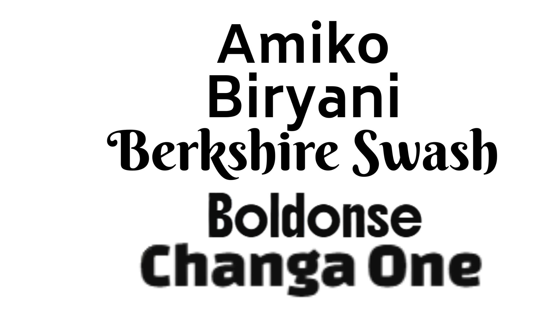
For the typefaces, I paired Berkshire Swash with Amiko, Biryani and Boldonse. Berkshire Swash gives the headings a fun, coastal flair that feels handwritten and friendly, while Amiko and Biryani keep paragraphs and navigation clean, readable, and modern. Boldonse is impactful. I also changed my Orange headers to Changa One to add to the fun. This mix balances personality and professionalism, which matches South Padre Island’s identity as both a vacation hotspot and a close-knit coastal community.
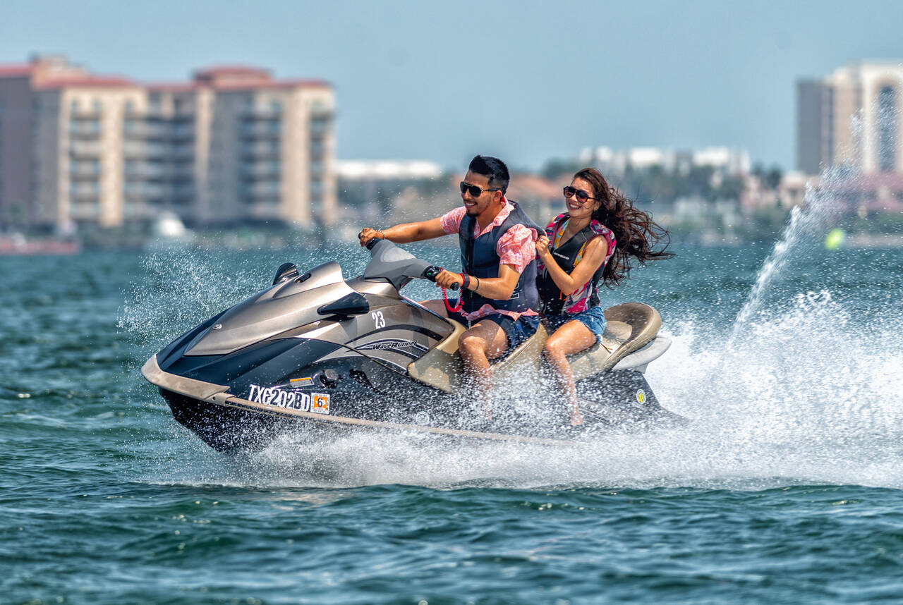
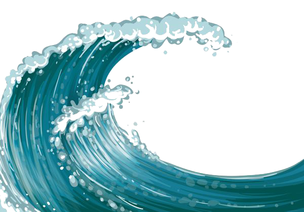
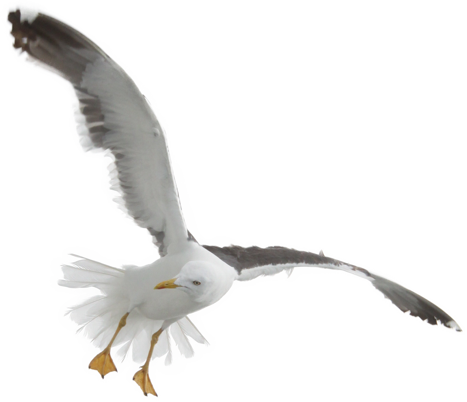
For the animations, I chose to have fun with some extra images to add movement and fill the background. There is consistent movement throughout, with one animation leading to the next like a relay race. It starts with a jetskier riding a sick wave followed by another wave, once the waves are over, the movement in the background tiles becomes more apparent, like hangover spins. Lastly there are adult beverage models rising and siking at the bottom of the webpage, consistantly moving. The index page is the only page with both waves. The rest of the pages have the jetski transition. And then I got a little carried away and had a ton of fun throwing in other stuff. The ball and the bird movement were a complete accident that I chose to then utilize.